Clustering Of Airport Delays
November 08, 2016Jocelyn Ong
Running principal component analysis and clustering algorithms on airport delays, cancellations and diversions.
Introduction
Who hates it when their flight gets delayed? *hand waves* Or worse, when it gets cancelled?
This week, we look at airport information for Project 7 of the General Assembly , and try to cluster delay, cancellation and/ or diversion data to see if we can find any patterns.
TL;DR
We looked at airport delay information and tried to find clusters within those data points. With various types of delay information available to us, we tried to cut it down by running principal component analysis, and managed to reduce our feature set to three principal components that represented 85% of the explained variance. Using these principal components, we ran our clustering algorithms which returned two clusters. One of the clusters was considerably smaller than the other and was mainly made up of airports in the Eastern FAA region. When we examined the original delay information (before principal component analysis), we noted that the airports in this cluster generally had longer delay times and more delays, cancellations and diversions than those in the other cluster.
Exploration
We start out by exploring our data, to find relationships within our data.
What’s in each dataset?
We were provided with three datasets:
- Airport information (mainly location information)
- Flight delay information for the years 2004 to 2014
- Flight cancellation and diversion information for the years 2004 to 2014
We have location information for more than 5,000 airports, but the other two datasets only included information for a little over 70 airports. Since our features are going to be the delay, cancellation and diversion information, we’re limited to those airports. This reduced the size our data considerably, but we still had a sizable dataset as we had observations for 11 years.
We merged all three datasets on the airport code, and will be using this combined dataset for our analysis.
Visualizations
Correlations
# Create a mask so that only one half of our heatmap shows up
# This takes out duplicates in the grid and also the spots where a variable is being compared to itself
mask = np.zeros_like(df.corr(), dtype=np.bool)
mask[np.triu_indices_from(mask)] = True
sns.heatmap(df.corr(), mask=mask.T);
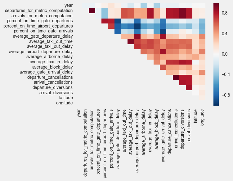
- Cancellations and diversions are highly correlated
- Percentage of on time gate departures, airport departures, gate arrivals, average departure delay, and average arrival delay are highly correlated (both positively and negatively)
- Average taxi out time and taxi out delay has medium correlation with other delays as well as cancellations and diversions
- Average taxi in time has high correlation with cancellations and diversions
Distribution of data
I decided to use seaborn swarm plots to study the distribution of data and first created a helper plotting function.
def plot_swarm(x, y, hue, data, xlab=None, ylab=None, title=None):
    plt.subplots(figsize=(16,8));
    ax = sns.swarmplot(x=x, y=y, hue=hue, data=data);
    plt.xticks(fontsize=15);
    plt.yticks(fontsize=15);
    if ylab is not None:
        plt.ylabel(ylab, fontsize=20);
    if xlab is not None:
        plt.xlabel(xlab, fontsize=20);
    if title is not None:
        plt.title(title);
By year
for i in plot_cols:
    plot_swarm("year", i, hue=None, data=df, xlab="Year",
           ylab=i, title= i + " by year")
Some of our outputs:

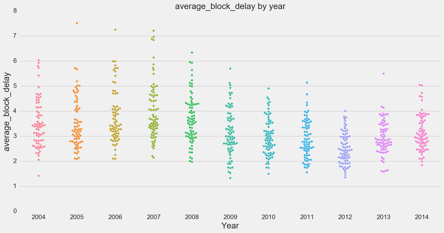
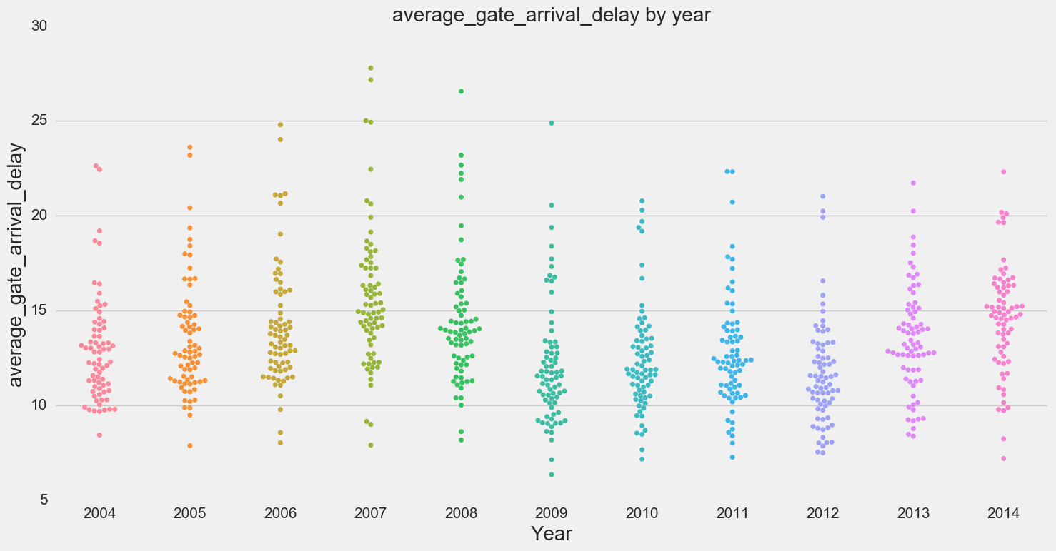
- No apparent pattern visible by year except for block delay and gate arrival delay
By FAA region
for i in plot_cols:
    plot_swarm("faa_region", i, hue=None, data=df, xlab="faa_region",
           ylab=i, title= i + " by region")
Some of our outputs:

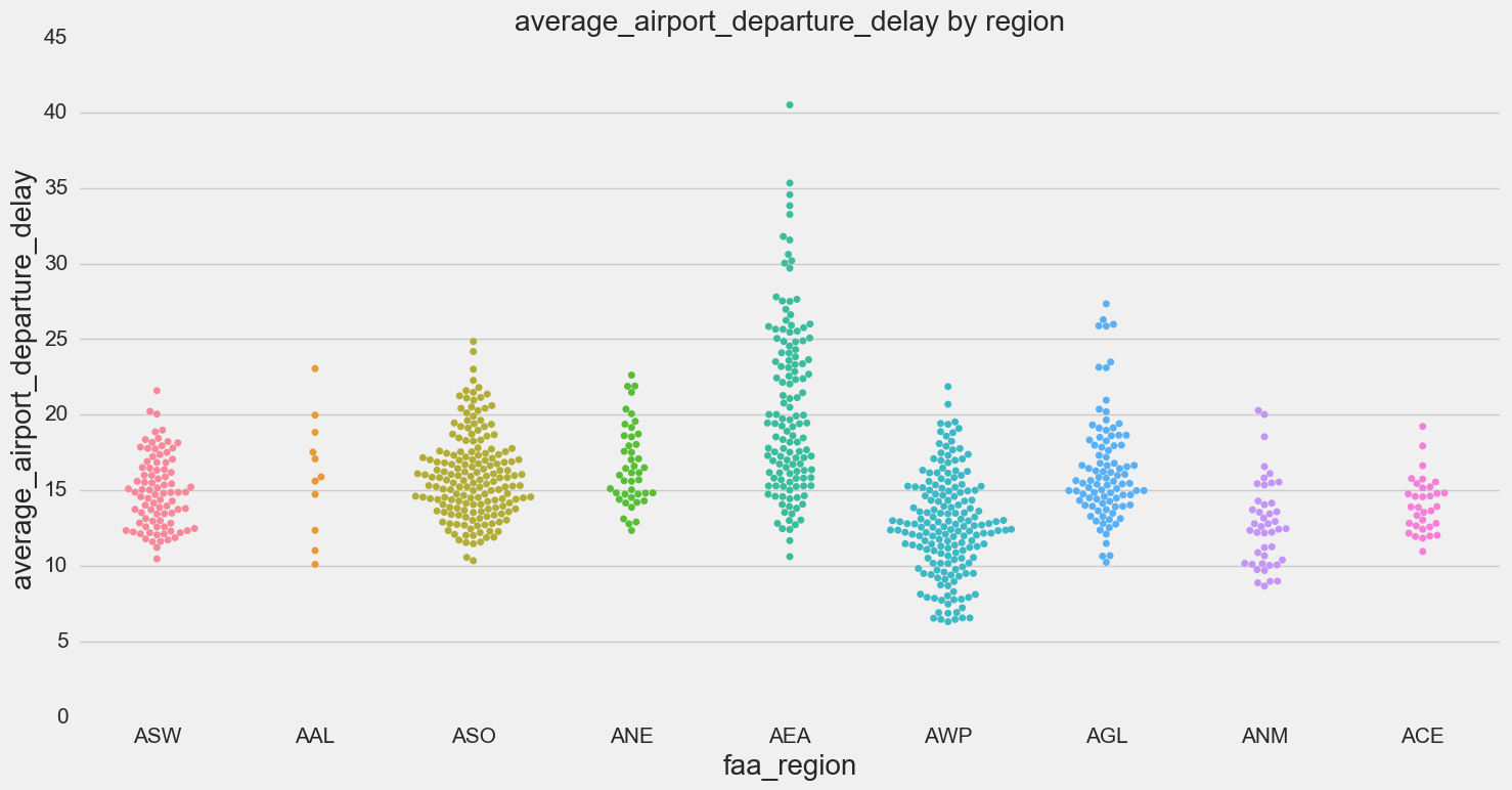
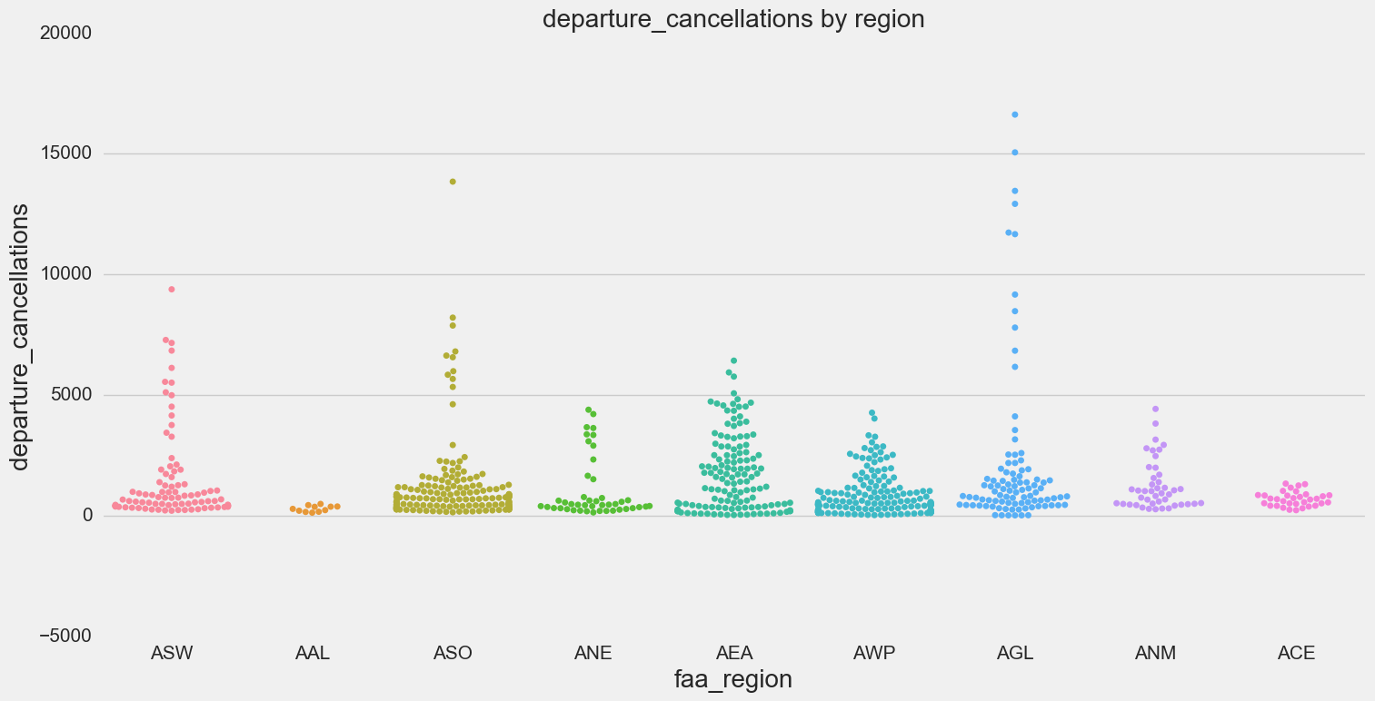
- Swarm plots by region show that certain regions have higher delays (in particular AEA - Eastern)
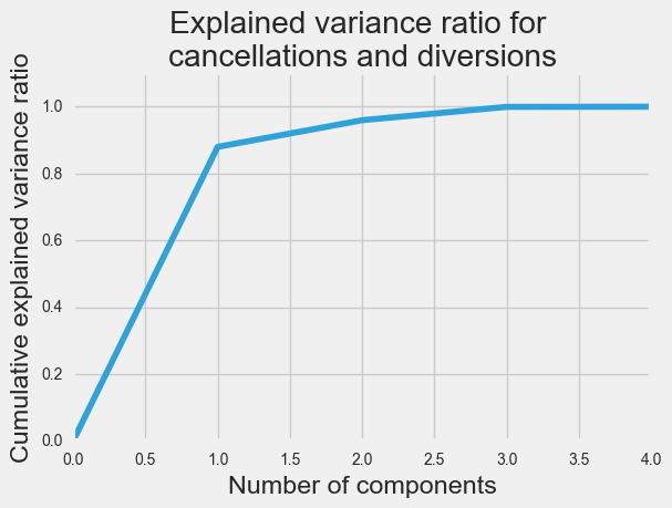
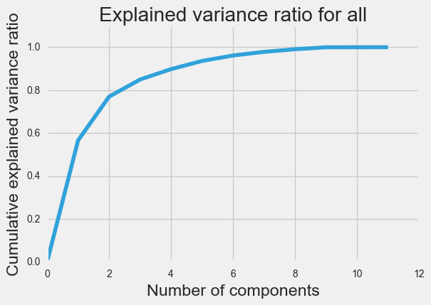
Principal component analysis (PCA)
I ran PCA three times:
- just delay information
- just cancellation and diversion information
- all delay, cancellation and diversion information
In the first and last cases, we were able to represent 85% of the explained variance with just three principal components. For cancellation and diversion, only one principal component was required.

Clustering
Testing different algorithms
Adapting the code from one of our lectures, I created an iPython interact widget to explore different clustering algorithms as well as how clusters change when we use different features in our principal component analysis.
def plot_dbscan(db, X):
    fig = plt.figure(figsize=(10,8))

    core_samples_mask = np.zeros_like(db.labels_, dtype=bool)
    core_samples_mask[db.core_sample_indices_] = True
    labels = db.labels_

    # Number of clusters in labels, ignoring noise if present.
    n_clusters_ = len(set(labels)) - (1 if -1 in labels else 0)

    # Black removed and is used for noise instead.
    unique_labels = set(labels)
    colors = plt.cm.Spectral(np.linspace(0, 1, len(unique_labels)))
    for k, col in zip(unique_labels, colors):
        if k == -1:
            # Black used for noise.
            col = 'k'

        class_member_mask = (labels == k)

        xy = X[class_member_mask & core_samples_mask]
        plt.plot(xy[:, 0], xy[:, 1], 'o', markerfacecolor=col,
                 markeredgecolor='k', markersize=5)

        xy = X[class_member_mask & ~core_samples_mask]
        plt.plot(xy[:, 0], xy[:, 1], 'o', markerfacecolor=col,
                 markeredgecolor='k', markersize=5)

    plt.title('Number of clusters: %d' % n_clusters_);
def plot_others(db, X):
    fig = plt.figure(figsize=(10,8))
    labels = list(db.labels_)

    # Number of clusters in labels, ignoring noise if present.
    n_clusters_ = len(set(labels))
    plt.scatter(X[:,0], X[:,1], c= list(labels),s=50, cmap="rainbow")
    plt.title('Number of clusters: %d' % n_clusters_);
def tweaker(data, eps, min_samples, model, k):
    if data == "delay":
        X = delay.as_matrix()
    elif data == "all":
        X = pc.as_matrix()
    if model == "db":
        db = cluster.DBSCAN(eps=eps, min_samples=min_samples)
        db.fit(X)
        plot_dbscan(db, X)
    elif model == "kmeans":
        db = cluster.KMeans(n_clusters=k)
        db.fit(X)
        plot_others(db, X)
    elif model == "hierarchical":
        db = cluster.AgglomerativeClustering(n_clusters=k)
        db.fit(X)
        plot_others(db, X)

interact(tweaker, data=["delay", "all"],eps=(0.1,2.0,0.1), min_samples=(5,20,1),
        model = ["db", "kmeans", "hierarchical"], k=(2,5,1));
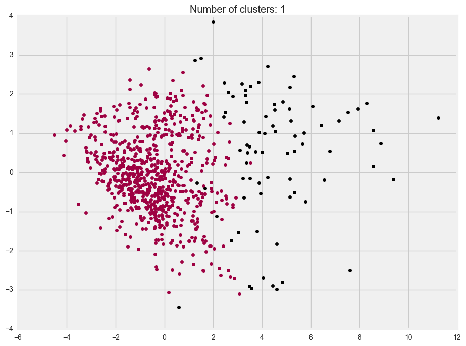
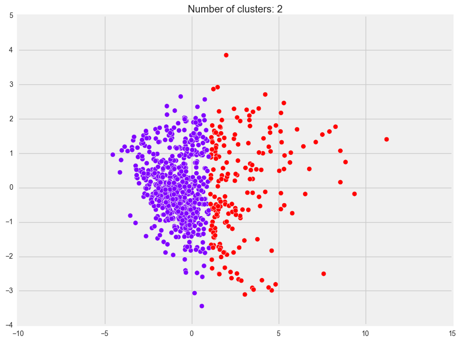
We considered DBSCAN, KMeans and Agglomerative (a.k.a. hierarchical) clustering, and here are the outputs using just the principal components of the delay information:
-
DBSCAN
-
KMeans
-
Agglomerative
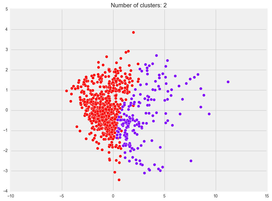
You’ll note that all three plots look similar. However, in DBSCAN, the “second cluster” is actually treated as noise (that’s why it’s black). This would probably be because our data seems quite evenly spread out and there aren’t any distinct groups that we can see.
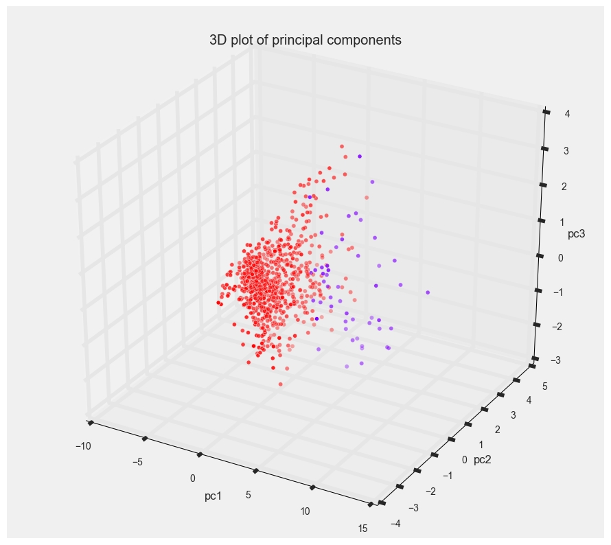
Here’s a 3-dimensional plot of our delay principal components and the clustering results from the agglomerative clustering. In 3D, there seems to be a better separation of points visually.
Interpreting our results
To interpret our results, we added the cluster labels from the clustering (we used the results from agglomerative clustering) to our original data. Each metric column (delay, cancellations and diversions) was then plotted for cluster 1 and cluster 2 separately to see if we can find out how the clustering was done.
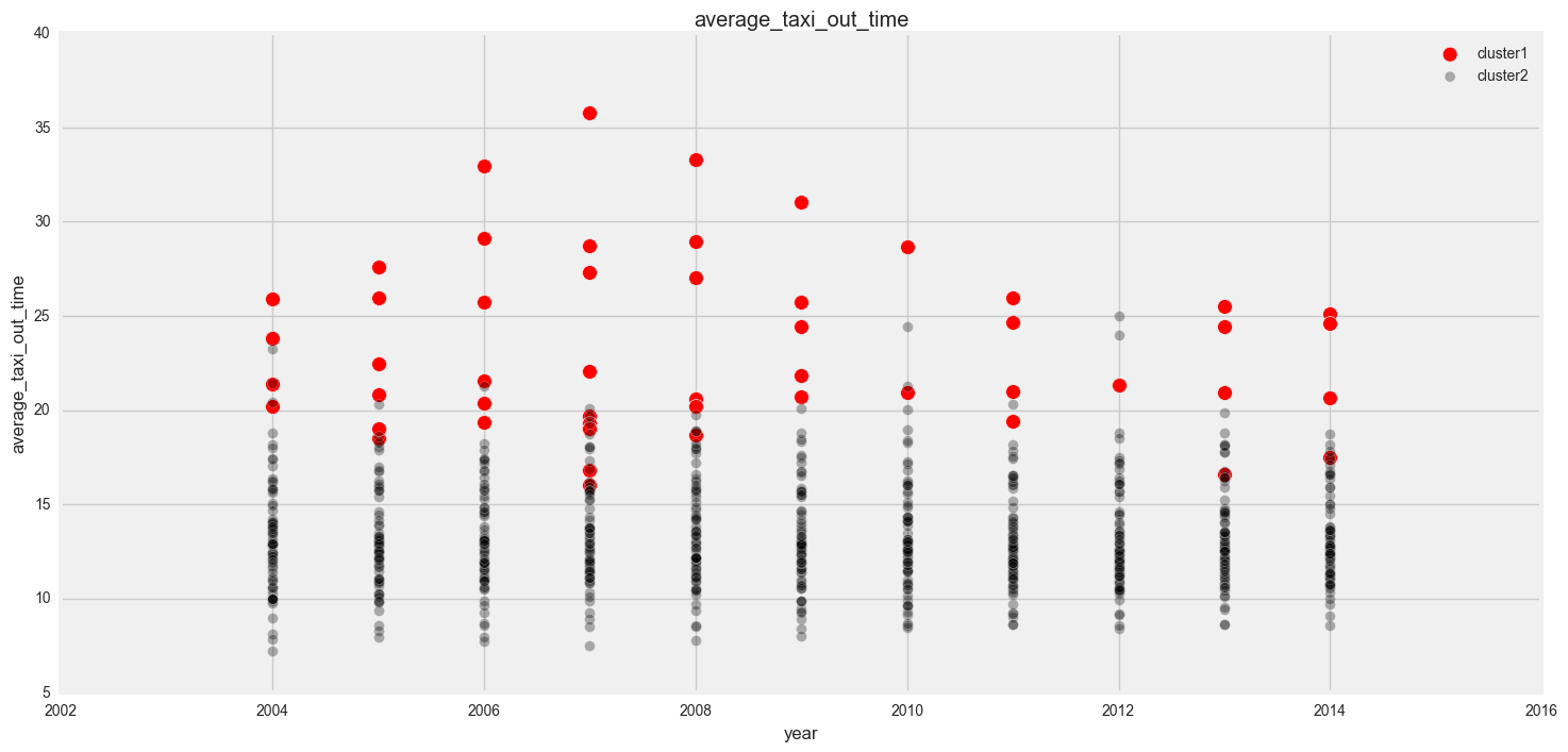
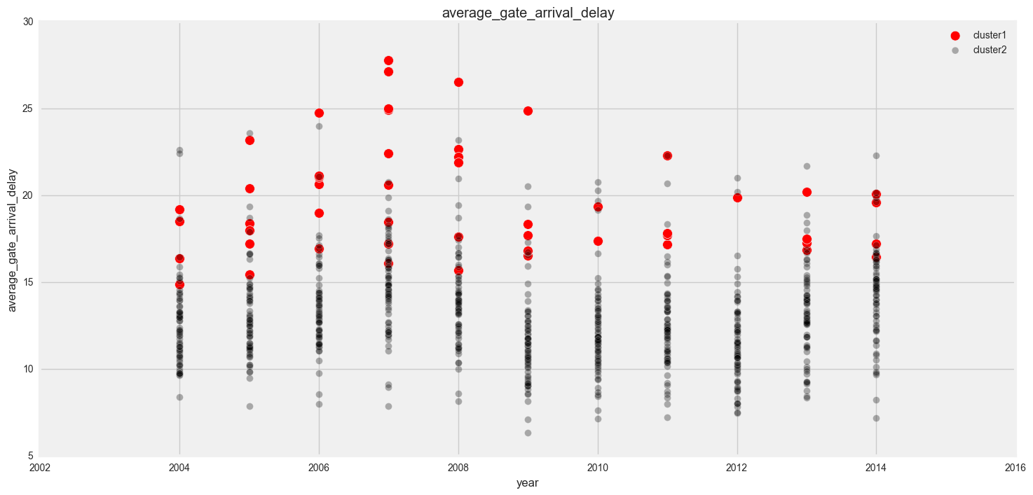
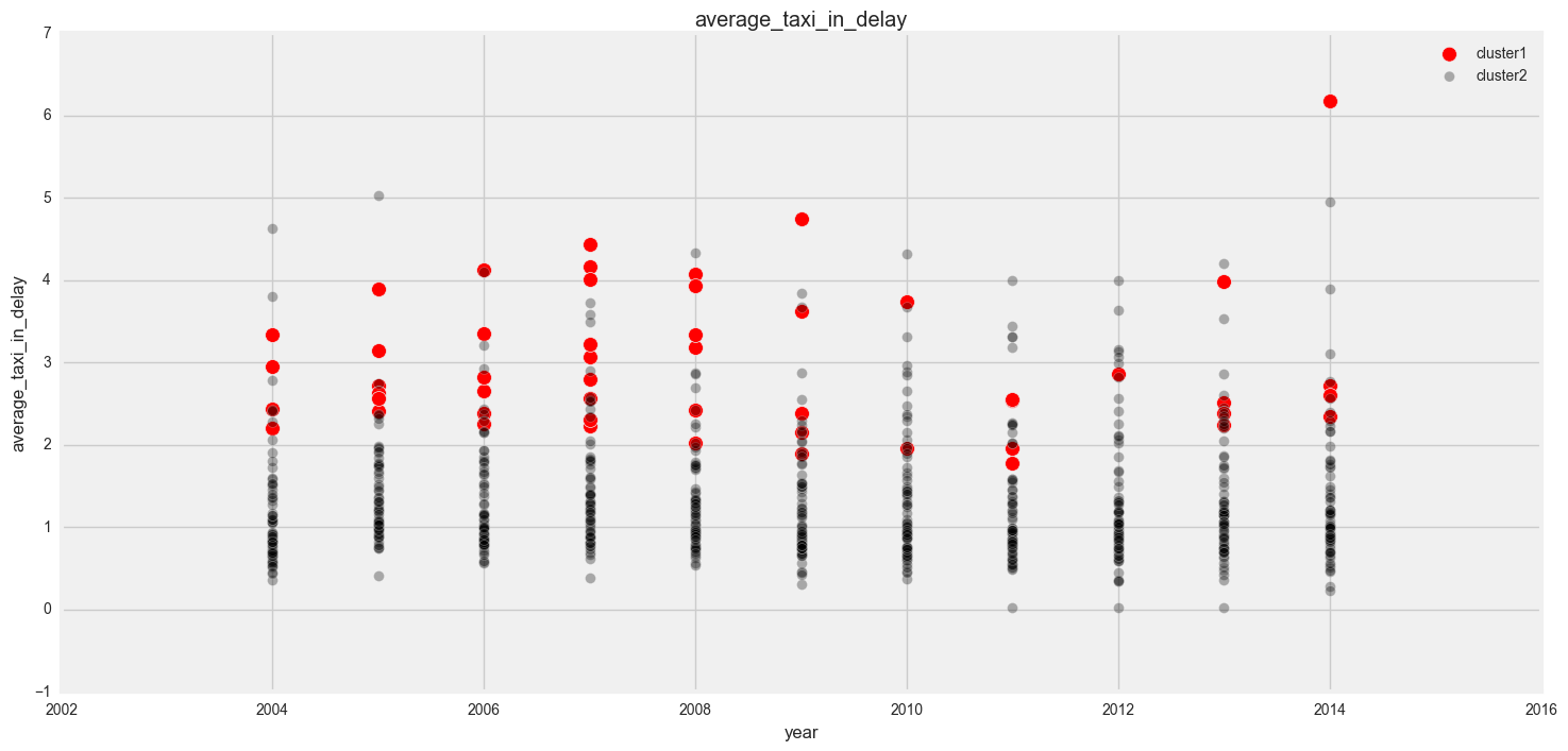
In our plots, we can see that in general, cluster 1 has more delays, cancellations and diversions than cluster 1.
I also plotted one of the columns against region and year to see if there were and discernible patterns there.
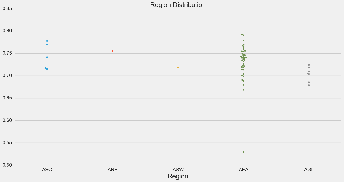

There’s no discernible in year, but it seems like cluster 1 is mainly made up of airports from the Eastern FAA region.
Round up
This project was difficult for me - I took a long time trying to figure out what was required and trying to match the instructions provided to us to the starter code provided to us. I finally decided to ask if I could start a notebook from scratch instead of trying to answer the different questions in the starter code (thank you for saying yes to that), and started building up the notebook from there.
Our goal was to determine if there there were any clusters in the airports based on their delays, and from there, see if there were any underlying reasons for the delays. Based on our analysis, we did manage to find a cluster of airports that were usually had more delays than others, and a lot of them were in the Eastern FAA region. Our next step is to then go further into this to see if there are any conditions specific to the Eastern FAA region that could have caused this (weather maybe?).
Thank you for reading this post about clustering airport delays! You can view my notebook here - please feel free to download it to play around with the iPython widget!
Back to top ↑