Sat Scores In The United States
September 26, 2016Jocelyn Ong
Using Python, its various libraries, and Tableau, we conduct a basic exploratory analysis of SAT scores in the United States.
What we want to do
We would like to see what the data can tell us about SAT scores and the proportion of people in each state who attempt the SAT.
We could also if there is any correlation between any of the data - if there is, such data could be used for prediction purposes. For example, if verbal scores and math scores are highly correlated, we may be able to predict the mean verbal score of a state when we are given just the mean math score.
What is the data about
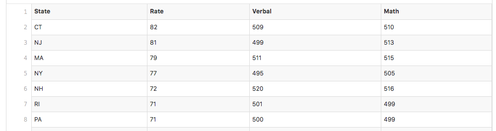
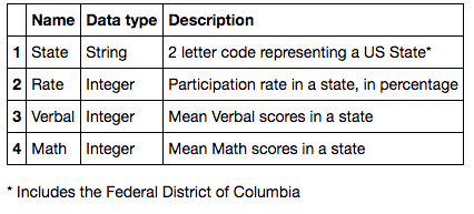
The data in the csv file is described as follows:
Reading the data
import pandas as pd
df = pd.read_csv('sat_scores.csv')
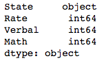
Using Pandas, we read our csv file into a data frame - this will make our subsequent steps much easier. Pandas intuitively converts the data in each column to the most likely type, and a quick check will confirm that the columns Rate, Verbal and Math have been processed as integers.
df.dtypes
Statistics
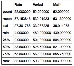
Using a data frame also allows us a broad overview of the numerical columns which covers common statistical measures - mean, standard deviation, minimum, maximum, as well as the quartiles:
df.describe()
Plotting the data
Visualization sometimes allows us to quickly spot patterns and relationships within the data.
Seaborn
Using Seaborn, we can quickly plot each numerical column against the others - this is useful to observing the relationships between columns.
import seaborn as sns
sns.pairplot(df)
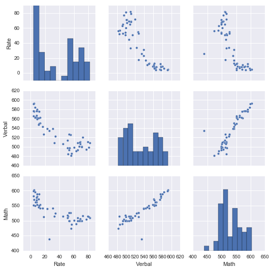
Based on the pairplot:
- Verbal scores and Math scores are positively correlated
- Participation rate and Verbal scores seem to be negatively correlated
- Participation rate and Verbal scores seem to be negatively correlated
- The relationship between Verbal scores and Math scores are strong than the relationship between Participation Rate and either of the scores
Tableau
In addition to the pairplot, we can also observe the data distribution by geographical region on Tableau.
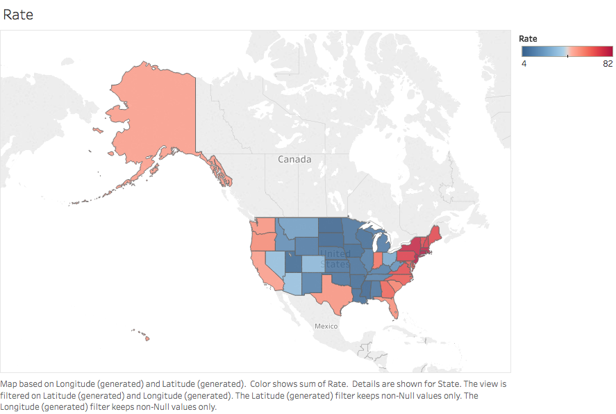


Participation rates in the NorthEast region are amongst the highest, but lower than average mean scores are also observed. We would expect that the lower mean scores are as a result of high variance in the scores obtained by the numerous candidates in the area.
In the MidWest, participation rates are low, but mean scores are amongst the highest. It is likely that the few candidates from the MidWest who did participate in the SAT examination did very well.
Unfortunately, without the raw data of the scores obtained each candidate, we will not be able to verify these hypotheses.
Until next time
This week, we’ve looked at how to use Pandas, Seaborn, and Tableau to do a cursory analysis and visualization of our dataset. This will help us determine what detailed analyses to be run on the dataset and whether additional information is required.
I hope you enjoyed this post, and I look forward to bringing you more insights on data science.
You can view my notebook for this project here.
Back to top ↑